Noom
Paid social, lifecycle and CRM for an always-on testing account
A new test every week. One system that holds.
Noom’s paid social, lifecycle and CRM account is always on: fresh A/B tests shipped every week against seasonal hooks, comparison angles and proof points. As senior designer and art director I conceived and designed the creative and directed a motion team, on templates that could be re-skinned weekly without the brand drifting.
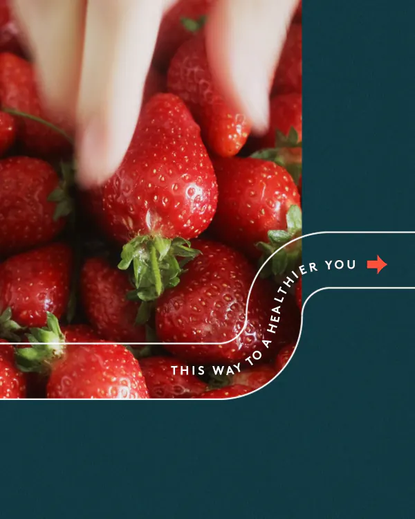
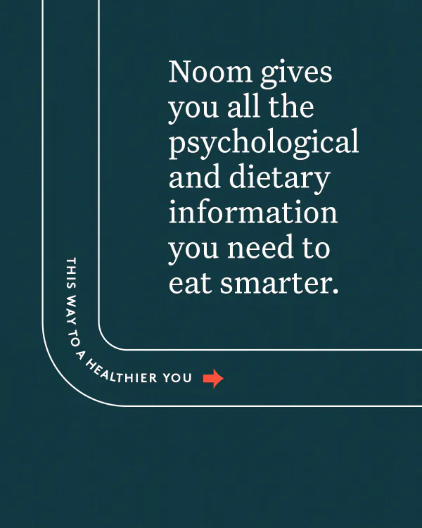
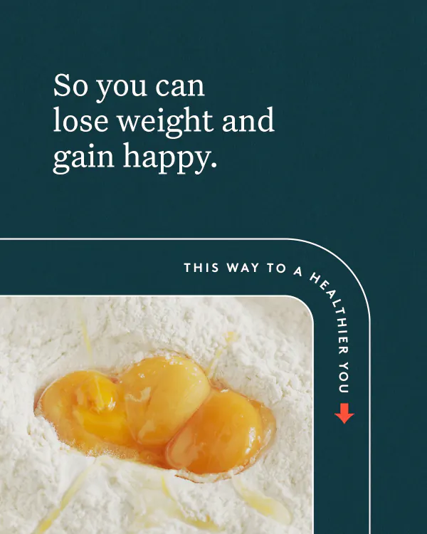
«This Way to a Healthier You»
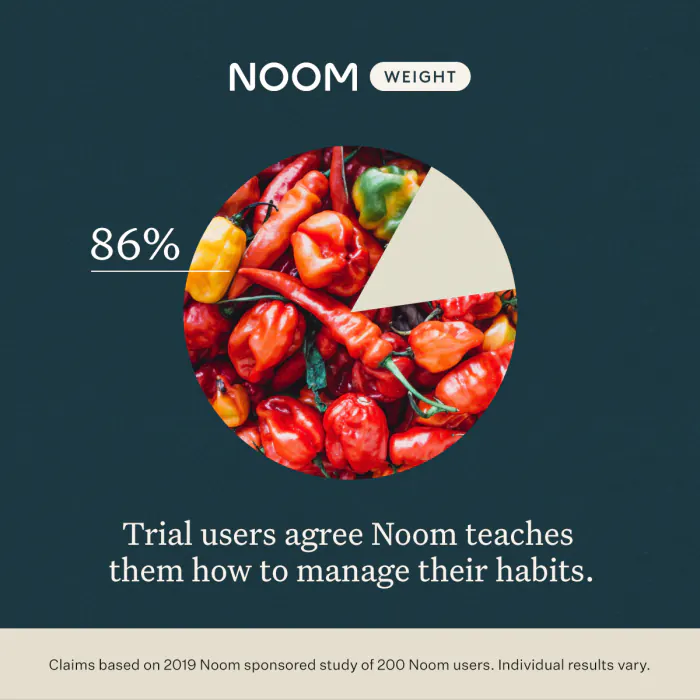
A short-form video system built to be re-skinned weekly: one line-drawn corridor motif carries the eye from a macro food shot into a claim, then into the stat that backs it up. Colour, produce, and proof point rotate by variant — the finished cut, followed by four of the tested weekly stills.
The finished cut
Four beats — hook, claim, benefit, proof. The corridor, the pacing and the type hierarchy are the only things that never change.
20 seconds4:5silent loop
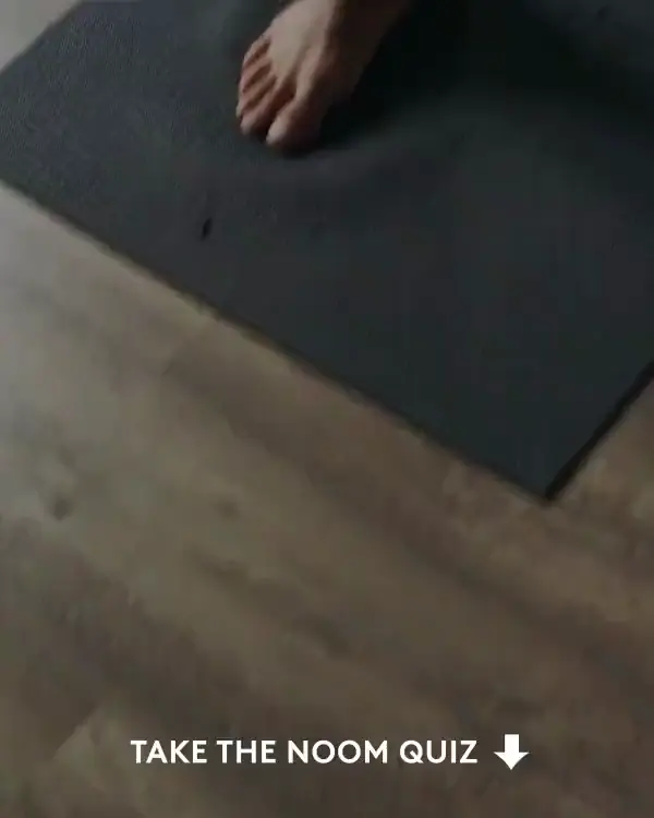
The four beats of the cut
The order the viewer sees them in — the last frame is the proof card above, reused as the end card.
No week invents a colour.
Core neutrals hold the frame, one accent family owns the week, and the produce is cast to match it — which is why four very different-looking variants still read as one account.
Core
Accent — one family per week
Eight in the family; four of them ran in the weeks shown above.
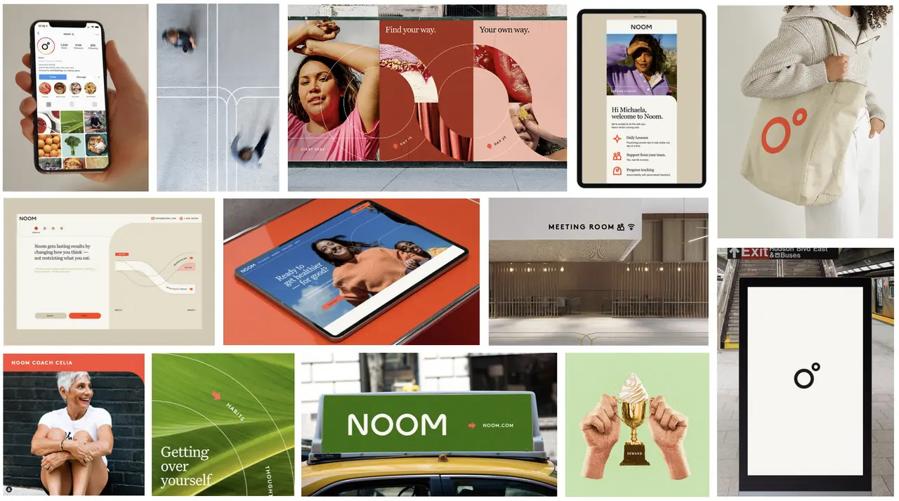
The brand world
The system out in the world — app, out-of-home, packaging and print.
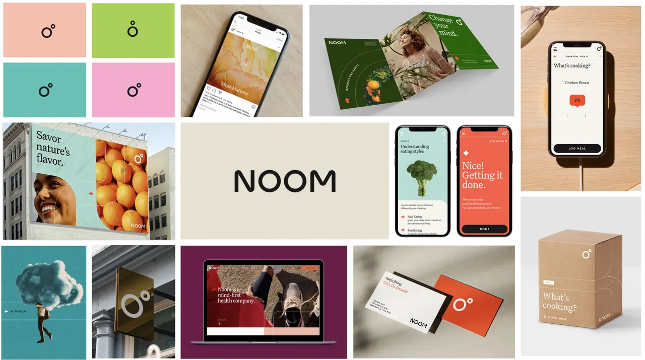
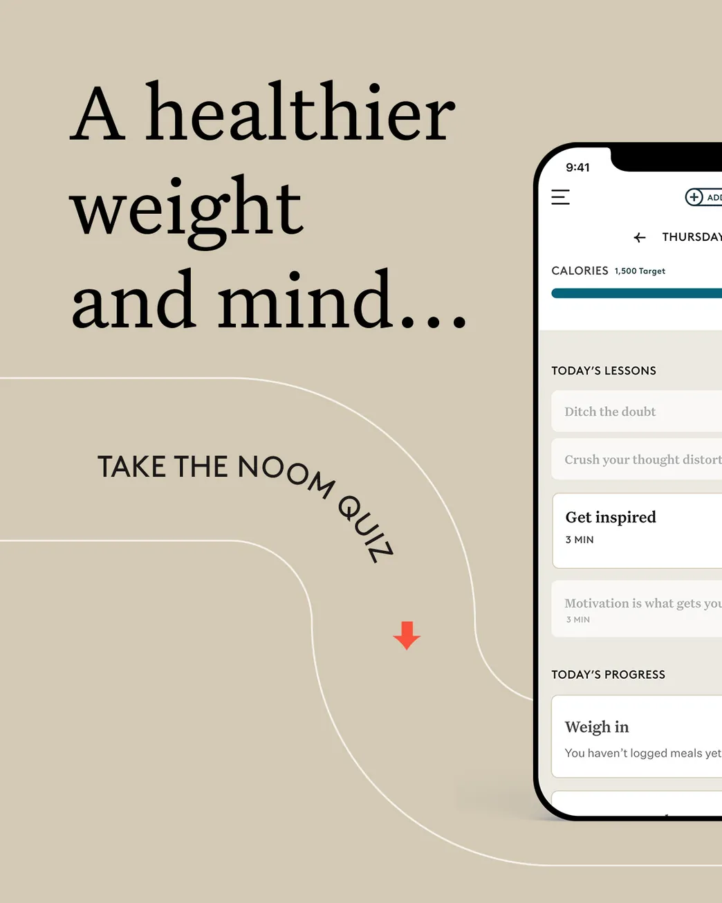
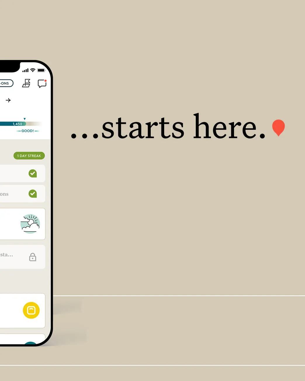
«Take the Quiz» — the always-on system
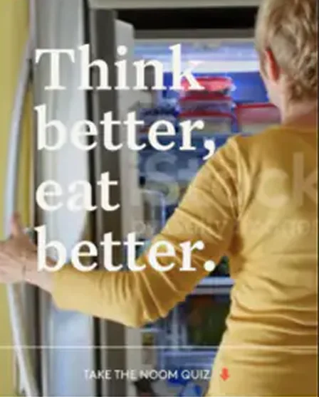
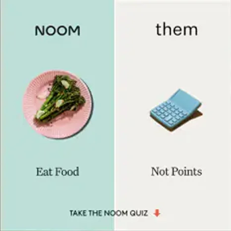
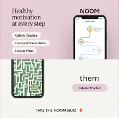
The workhorse of the account: one modular ad template, rebuilt every week against a new hook — a holiday, a comparison chart, a flat-colour test — so the testing pipeline never went stale.
Open a week to see its set — each sheet scrolls sideways to show the whole run.
From flat type to full lifestyle photography
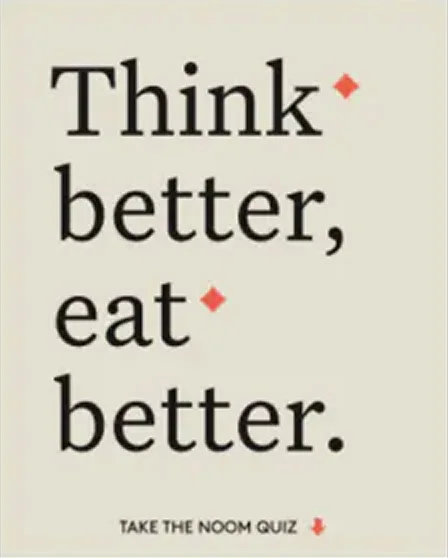
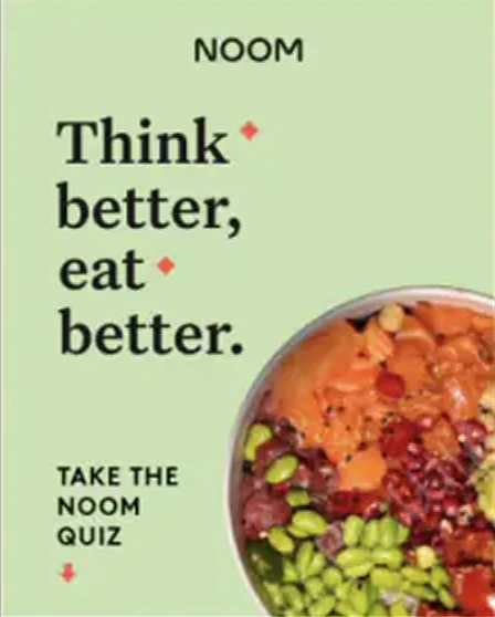
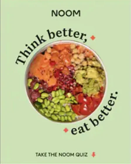
Flat-colour quiz variants in pink

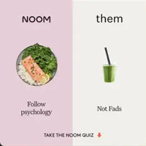
The comparison angle, set by set

One hook every week
One modular template. The ask never changes; everything around it does.